How to photograph handwriting for engraving
Lay the note flat in even daylight and hold your camera directly above it. Frame the words you want to keep, including the ends of strokes and any dots or flourishes.
Compare the same note at two sizes ↓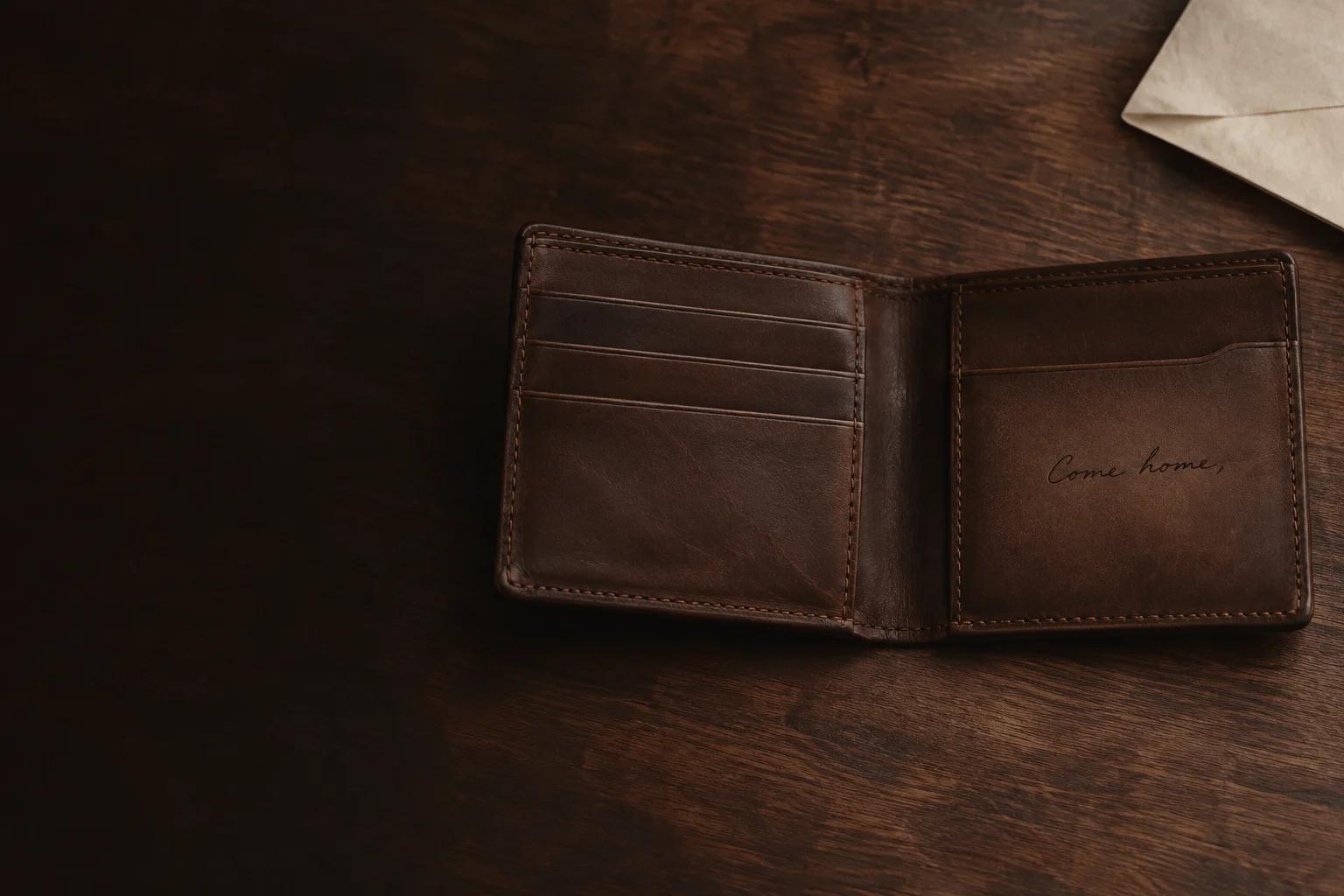
Should I use a photo or a scan?
Use a scan if you can lay the paper flat without damaging it. For a card, a letter with a fold, or a note in a bound book, use your phone and move the light until the words are evenly lit. Keep the original image so you can try a different crop later.
Check the faintest line at full size before uploading. Take a closer photo if the edge of a letter blurs into the paper. If a shadow crosses the writing, move your phone or the note and take another picture.
Can I keep the original handwriting?
Choose As written in the Hem & Grain preview. It aims to remove the paper and shadows while preserving the original strokes. Compare the result with the note. Check thin strokes, punctuation, and gaps inside letters such as e and a.
Crop out unrelated writing and decorative borders before uploading. Leave a margin around the words so loops and descenders stay intact. If a faint signature shares the page with a dark fold, take a new photo in softer light before cleaning up the drawing.
How much handwriting fits inside a bifold?
A short sign-off or a few words are a good starting point. The inside panel in the bifold preview uses a 58 × 40 mm artwork box. For several lines, try the A5 journal cover, where the centered preview area is 110 × 120 mm. These measurements describe the preview layouts.
Look at the words at the chosen size before you approve them. If letters merge or thin strokes disappear, try fewer words or give the original note more space.
What happens to a thin handwritten note inside a wallet?
In our example, the inside wallet preview kept 35% of the dark strokes at the default line weight. Raising the line weight one step raised that to 98.5%. The larger A5 cover kept 98.5% at the default setting.
| Line weight | Wallet inside 58 × 40 mm | A5 cover 110 × 120 mm |
|---|---|---|
| Default | 35% | 98.5% |
| One step thicker | 98.5% | 100% |
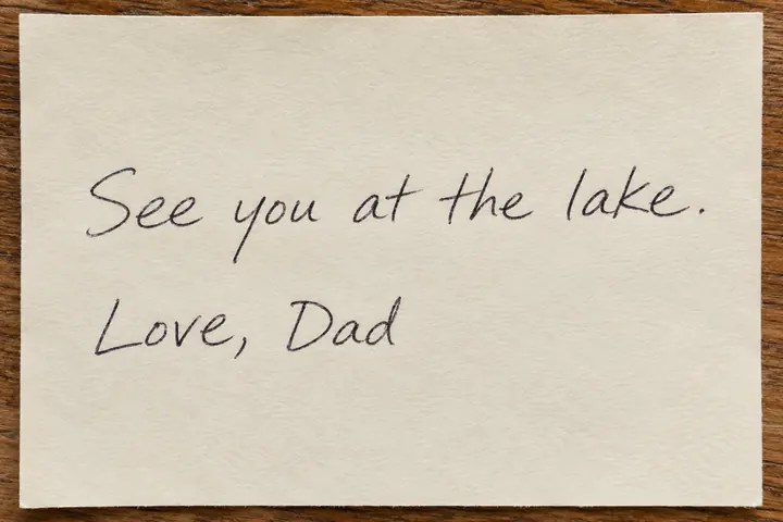
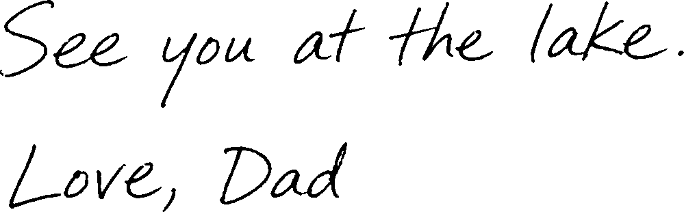
Compare the letter shapes and spacing against the original after changing line weight. Thicker strokes can close the small gaps inside letters.
How we ran the digital check
We used one synthetic sample note and the As written drawing at standard detail. The table shows the share of dark strokes that survived. The check also measures light spaces. We fit each drawing inside the preview box without stretching it and applied the same detail check as the storefront preview. It requires at least 90% of both dark marks and light spaces to survive under an assumed 0.3 mm minimum feature size. We ran these checks on screen. Physical engraving results depend on the material and equipment.